
Oh, trading figures...For some odd reason I never get tired of collecting them.
If you haven't guessed by now (or if you haven't read the About Us page), I'm a gamer, so I often pick up figures or books from my favourite series. Most of the figures I have just happen to be trading figures. They're more affordable than the 1/8 figures anyway, so you might not see many of them giant ones from me. Since we're on the topic of trading figures, today I'm going to review the Kingdom Hearts Formation Arts Vol. 3 series.
The paint job for all the figures is a bit sloppy and the expressions are severely disappointing up close. I'm not sure why Square Enix did it, but their quality control was horrible. Even the sculpt quality is inconsistent. Some figures are extremely difficult to put together, while others are relatively easy. Each Formation Arts figure comes in about three to four pieces. You'd think they would piece together nicely, but they don't. Some buyers will have trouble, while some not so much. At least you can appreciate the lovely base that comes with every figure!
[Sora]
Let's start with our hero (and lovable dork) Sora. I'm actually quite happy that they made a Final Form formation arts figure of him. The Final Form outfit is, in my opinion, one of the best outfits Square Enix could give Sora in Kingdom Hearts II. I mean, the boy's got two Keyblades attached to his back! Plus the black and white theme seems perfect when you think of both Sora and Roxas.
Unfortunately Sora's expression on this figure may make you cringe. From far away it looks perfectly fine, but once you see the details up close, you'll wish you could change it up. It's got to be the lips...or the expression. Or both.
I will definitely give Square Enix an 'A' for pose/style, but I can find so many flaws to this figure. For example, the paint job looks very sloppy, especially on the OathKeeper Keyblade.
 |
| The green makes me very sad. |
It appears as though the manufacturers used a green sharpie and drew the lines on the blade ever so carelessly. I mean, at least make it less obvious, guys. Fortunately the base is well done. It has a good structure and was painted nicely to the point where you can't really find any flaws to it (thank goodness). From far away, this Sora figure looks nice. I guess that's because you can't really examine the poor qualities from a distance.
 |
| I think the Oblivion Keyblade (Right) is the most attractive part of this shot... |
 |
| There is something obviously wrong Sora's knee... |


[Naminé]
I think Naminé has one of the most beautiful and clean bases. The flower chair is very elegant and practically flawless compared to everything else. It is styled magnificently with the spiral staircase surrounding Naminé, the innocent young witch sitting in her chair. Sure, Naminé's expression may seem a tad plain, but the overall figure is creative enough for you to let that little flaw slide.


Actually, the only things I truly dislike are the mini figures climbing the steps of the spiral staircase. I won't lie. This figure looks amazing from afar. But once you see what Sora, Donald, and Goofy look like up close, you'll cringe and probably retreat a few steps.


They most certainly do not complement Naminé's gentle expression, nor do they work well with the petals behind her. They're sloppy and disappointing. I'm just glad I can enjoy them from afar. I certainly wish there was something Naminé's sketchpad because her drawings were always very childish but adorable in the game. There definitely would have been an "aww" factor if Square Enix decided to include a tiny picture of Sora and his friends (drawn in crayon).


[Roxas]
The Roxas figure is actually quite creative! I love how Roxas is actually sitting at the bottom of the clock tower eating his seasalt ice cream. It's funny how he's supposed to be watching the sunset, but the sunset is behind him! While it isn't the most impressive sunset ever, I give Square credit for simply thinking of this idea for their Roxas figure. It fits him perfectly because at the end of every day in Kingdom Hearts II (during Roxas' arc), Roxas watched the sunset and ate ice cream with his friends.
One thing that really bothers me about this figure is that his skin tones aren't consistent. ...Wait, what?

If you at any of my photos up close, you'll see that Roxas' face is pale while his arms are tanned nicely. Trust me, this isn't because of my camera work. I looked at the figure up close myself and raised a brow. It's awkward and it makes me think that Square's manufacturers weren't very consistent. They did a very sloppy job...Unless Roxas really does have that kind of tan...Okay, I really doubt it. I'm just disappointed in that one flaw.
Roxas actually looks thoughtful on certain angles, which makes me a bit giddy because he's one of my favourite characters in the Kingdom Hearts series. You'll see that his expression will match his character in the game.


Overall, I honestly like the Roxas figure. It's definitely unique compared to the other figures I've purchased. It's too bad you can only show off one side of this figure. My Roxas figure is close to a wall after all.


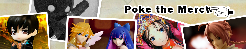
[Riku]
Riku’s figure definitely scores points in style! The green orb with diamond shaped points sticking out from the bottom was unexpected, as I don’t recall it being in the actual game, but it helps with angling the figure. It’s much better than using a plain blue base to tilt the contraption Riku’s riding, that’s for sure. The paint job is pretty sloppy, like it is for the rest of the Kingdom Hearts Formation Arts vol. 3 figures...
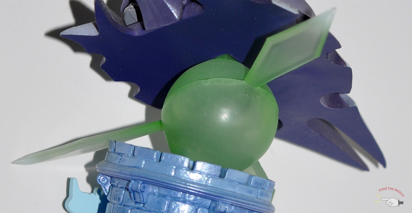
Riku doesn’t wear an angry or determined expression. Even if he did, I’m sure Square Enix might have messed that up... In any case, Riku has a pretty epic pose for his sweet ride. The machine he’s on is actually from one of the final battles in Kingdom Hearts II. With a Keyblade in his right hand and a flying device under his control, you can see Riku is geared for battle mode. It does add a bit of excitement to his figure. I love figures when they have unique poses.


My Riku’s arm seems very flimsy. Every time I pick him up and his hand accidentally grazes against a vertical surface, it either tilts or falls off. I always find myself reassembling him when I shouldn’t have to. I suppose I should be grateful his Keyblade isn’t so fragile it snaps in half whenever it comes in contact with something.


[Mickey]
I can't help but laugh at Mickey's figure. He's attacking a defenceless creature with a blunt object...Talk about cold blooded! Sure, Heartless are evil, but this is just a little shadow! He'd only slap at you in the game if you were near him. Slap!. Now look at the poor thing... He's about to get bashed over the head with a Keyblade.
Mickey is probably one of the best sculpted figures in this series. I absolutely love the textures used for the Traverse Town buildings. The stones on the floor are both smooth and bumpy, as they should be. The Heartless is simple, but sculpted and painted perfectly. I mean, it would be utterly sad and disappointing if the Heartless of all things was poorly painted.
 |
| Here's a better look at the floor texture |
 |
| Awesome walls from Traverse Town |
Mickey's head is very smooth compared to all the other figures. Then again, he doesn't have hair or anything pointy on his head for that matter. I love the extra bit they added to his Keyblade because it adds impact on a still figure. The mighty mouse is already has his weapon in mid-swing! You can only imagine what will happen next. The blue piece that he's standing on complements the rest of the figure very well as it is the only cool colour among a crowd of warm colours.


Summary
Poses: 9.5/10 (I absolutely love how each character has his/her unique pose. They're far more creative than many other trading figures I've seen out there!)
Sculpt: 7/10 (Some figures are difficult to piece together, while some are easy)
Paint: 6.5/10 (The paint job is only so-so for some of these figures)
Enjoyability: 9/10 (From far away, they are all very beautiful. Again, I love the colours and poses)
Overall: 8/10
The figures look great together on my desk. Apparently you can also collect the Kingdom Hearts Formation Arts figures and use them as chess pieces. How cool is that? I bet you can make a nice but clunky set if you grabbed these figures along with the ones from the first and second volume!
Manufacturer: Square Enix
Purchased from: AmiAmi
Price: 4680 ¥ (for a box of 6)
~Sui Chee
No comments:
Post a Comment