 I suppose some introductions are in order. I’m Ash, a figure collector and good friend of Suich and Jenn’s whom I call ‘Mom’ and ‘Deadbeat mom’ respectively. Like them, I too have an obsession with importing lots of sweet and expensive crap from Japan and so they invited me to do some reviews for the site!
Unlike Deadbeat mom and her harem of moe, PVC goddesses, my humble collection consists primarily of dudes in all their sinewy and strategically placed, bulge-y glory. My mission here on Poke the Merch will be to cover male figure reviews and do my part to increase attention for the tragically neglected, penis-having side of the scaled figure world. Good times. Now, let’s get to the actual review.
Kamui is from a beautiful comedy series called Gintama. Without being needlessly verbose about it, Gintama is brilliant. It is the greatest series ever. If you're feeling curious, I highly encourage you to check it out.
 |
| There's pure chaos lurking behind those angelic blue eyes. |
Except that he isn't one.
Kamui is completely unhinged, not to mention beset with LITERAL bloodthirstiness. He’s actually the psychotic older brother of the heroine, Kagura and one of the series’ main antagonists. In true Gintama fashion, the lofty tropes of old are crowned with lampshades, the sacred cows are wantonly tipped over and this patch-worked quilt of retro shounen idiosyncrasies can become the nastiest little fucker this side of the universe!
So how does his plastic likeness hold up against scrutiny? Let’s start with his box.
It’s not so much a box as it is an unwieldy monument to cardboard and plastic excess. It’s so titanic that I couldn't even get a decent picture of it. There are quite a few graphics of the figure itself and there are windows on the top, front and sides of the box. The windows on the side are small and reveal nothing. I suspect that their bewildering presence owes to some lumberjack's compassion towards a single tree left behind after its forest was cleared to provide the cardboard for this one box. The colour scheme brings to mind that of bathroom tiles. I get that MegaHouse was in a bind. Kamui is a guy and a dastardly one at that. They can’t exactly bust out the pastels and sparkles (such a shame too). They also couldn't make the windows too large because of the numerous and fragile accessories that come with the figure. Apparently they came to the conclusion that dark blue was the perfect hue to convey boyish villainy and that when it came to packaging Kamui with his numerous extras, it was better to play it safe and go big. So here we are. It does its job, but it does not look good doing it.


There’s nothing too special about Kamui’s base. It’s a plastic circle painted with a harsh red-black gradient. It does what it’s supposed to do and taking Kamui’s cape, parasol and pose into consideration, it is the only thing keeping him upright. It’s not unusual for bases to bear the name of the figure but there is something about the way Kamui poses on his marked base that strikes me as hilariously territorial. It is as if he’s saying, ‘Bitch, this is MY base’. I do like that Kamui’s name is written in embossed calligraphic kanji. Coupled with the coloration, it really exudes an old school samurai/kung-fu film vibe that I totally dig. Pertinent!

Kamui’s pose is fairly unimaginative which is unfortunately, typical of male figures. However, he is enveloped by a dynamic, grungy mantle and theatrically framed by his vibrant umbrella. The combination lends him an undeniably dramatic presence. Is it cheating? Absolutely, but I can’t help but fall for it anyway. He absolutely vogues when he's viewed from the side and there is something in his stance that strikes me as smugly provocative. Isn't that precious?


Kamui is an enigmatic character. With his hair-trigger responses and willing descent into instinctual oblivion, he's the sort of guy who can wear an expression of vacant contentedness in one moment and a cruel, sadistic sneer in the next. It's difficult to know whether these expressions are sincere or some sort of affectation. Instead of probing into the nebulous depths of character speculation, MegaHouse wisely avoided fan ire and provided collectors with two extra heads so that they can display Kamui sporting whatever expression they think is best.
I think the faces MegaHouse provided are wonderfully representative of Kamui's complex character. I personally favour displaying Kamui with his evil smirk but I do find his wide-eyed face disarmingly adorable. I also love his foxy expression. It's clearly the most ominous face of the three but since it lacks the pop of colour that the other two provide, I prefer to display him without it. The sculpt of the faces are aesthetically pleasing and true to Kamui's appearance in the anime. His eyes, when you can see them, are shiny with a glossy finish and a vibrant shade of blue. The definition of his lips and chin are particularly note-worthy. I also love the subtle differences in the way MegaHouse painted and positioned the eyebrows and sculpted the mouth on each face.


Kamui comes with three heads but only a single set of hair which comes in two parts and can be detached and re-attached to his each of his faces. (Gintama fans can insert a joke here about how this somehow relates to the fact that male pattern baldness is hereditary). Kamui's hair is a mixed bag. I love his exuberant, two-dimensional, little ahoge and certain clumps and strands of hair appear to be well-sculpted, shaded and suitably detailed. Contrary to the washed-out and bland photos, (Picasa's doing a weird thing right now but they should look fine if you click on them) his hair is a dark, rockin' vermilion as nature intended. His braid, while woefully flimsy, is also acceptably sculpted. However, on the back of his hair there are a forest of seam lines and clumps of hair that are strangely lumpy and completely lacking in sculpt or definition. The bangs on the front part of his hair are well done for the most part but there are a few seams and spotty paint jobs hidden throughout the hair piece. The giant fissure running across his head is somewhat forgivable because that's where the hair pieces separate. I suppose this was done in consideration for his cute little ears but because it runs horizontally relative to his head, it creates a bizarre parting.
You'll notice that Kamui has an impressive set of shounen 'canopy bangs'. It's cute and nostalgic but their presence makes getting a proper picture of his face a complete pain in the ass. Ah well, such is the nature of equivalent exchange.


+2.png)

Did I mention that Kamui is a CASTOFF? No?
That's because he isn't one, but you do have the option of removing his large mantle which is useful if you'd like to study the refined contours of his backside.
Without his cape, Kamui loses his volume and most of his whoosh. The wild undulations of his changshan provide a tamer but still rather lovely alternative to his billowing mantle and I do appreciate MegaHouse's attempt to give me a reason to display him cape-less. Sans umbrella, Kamui appears as though he's gesturing to himself whilst performing a shounen-esque grandstand. With his puffed-out chest, his pose still comes off as adorably arrogant.
I initially thought that his changshan seemed a bit too long but after consulting the source material, I discovered that it actually extends all the way to his ankles and the sculpt is therefore completely within the realms of authenticity. You've won this round, MegaHouse, but I'll get you next time.


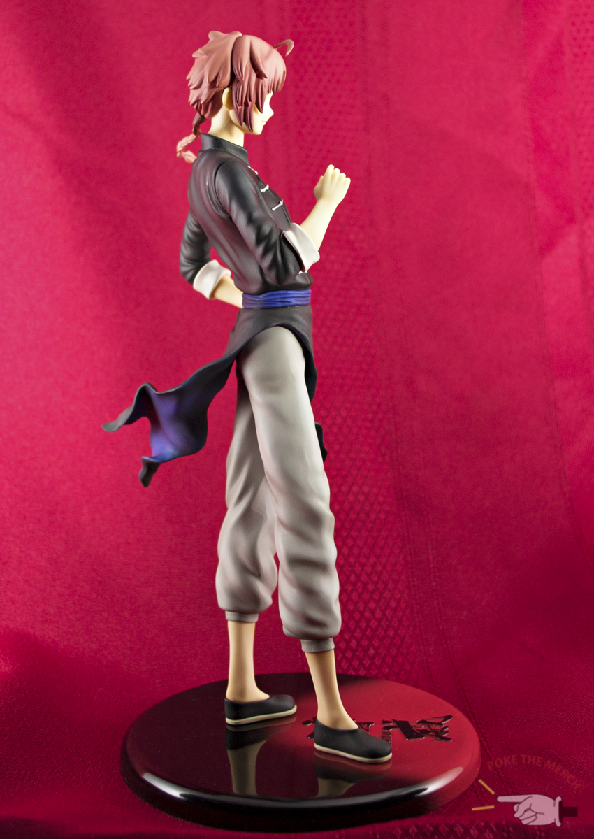


Kamui is lithe as opposed to muscular which is appropriate considering that he's both a martial artist and a pretty boy. However, he is also a young man passing out of his adolescence. MegaHouse did an admirable job in sculpting his body as judiciously as possible in this regard. His body appears masculine despite his lack of throbbing pectorals. His slender hips give rise to a lovely pair of broad shoulders that are particularly scrumptious when viewed from the back. The inconspicuous dip between his shoulder blades is a splendid touch.
The white clasps on his top are cleanly applied with little to no visible paint spillage. Their somewhat uneven placement on his top is a very subtle touch of quirky realism. The changshan itself has fantastic definition despite its black colouring. The pull lines around his shoulders, sleeves, and waistband are marvelous and successfully convey the tension in his clothes as though he carelessly pulled them on without adjusting them properly. I think of it as an implicit allusion to Kamui's warrior-like disregard for ornamentation. The white cuffs of his sleeve are nicely shaded and the left cuff even has small folds sculpted into it.
The combination of glue and PVC skin grafts that often plague the empty spaces between figures and their clothing is a complete turn-off so I am very pleased that MegaHouse created space and shadow where Kamui's arms disappear into his sleeves, thus successfully creating the illusion of depth.


I love Kamui's adorable, puffy pants. The paint is smooth, the shading is impeccable and the draping is a masterstroke. MegaHouse lays down some sweet congruity by sculpting the folds of the pants so that they appear to be buffeted by a strong wind.
Now, I know what you're thinking, "Who cares about all that, where are the ass shots?" Sorry it took so long.


Kamui isn't the most colourful figure on the market and there is an abundance of grey due to the presence of his mantle. It makes it so that the teasing flashes of colour from his fluttering changshan are made that much more delectable. After all, it's when you’re looking at a rippling wasteland that the calculated pops of colour are really able to candy the retinas. The dirty, startling shalt blues, the grungy, well-shaded greys and stark blacks create a striking combination. His accouterments may be eastern in style but his colours are gorgeously industrial. Yummy!


Kamui's ghost white skin tone is actually completely canon and a common trait among Gintama's dreaded Yato clan. The sun is actually their greatest weakness and prolonged exposure can be deadly to them which is why they are almost never seen without their parasols. Kamui is even known to parade around mummy-style in an attempt to stave off the sun's deadly UV, Yato-killin' rays. So it's not a painting error or negligence on the part of MegaHouse. That doll-like, anemic skin colour is completely legit.
Kamui's pale, delicate limbs are sculpted wonderfully for the most part. MegaHouse successfully depicts the subtle bone structures of Kamui's wrists and ankles as well as his thin, practically translucent skin. You'd swear you could see his veins. His hands are nuanced and I'm partial to the little tweaks of his fingers. The problem with Kamui's left hand is that his palm doesn't completely touch his side. Rather than placing a hand on his hip, it just hovers right above it. This is pretty commonplace for a lot of figures but just because something is conventional doesn't make it acceptable. The placement of the hand is unnatural but it is easy to ignore.


Kamui’s umbrella is a flower blooming in my heart. It's delicious, it's heady, it's purple in both colour and mode. The handle is actually made of metal, which makes sense considering how heavy it is. PVC would have snapped long ago under its tremendous weight. It's also totally canon! The Yato use their umbrellas as weapons which function both as clubs and firearms and naturally, they are made of metal. Kamui's parasol is the resultant offspring of the lovely marriage between structural necessity and verisimilitude!

Is Kamui as flawless as the series from which he hails? Nope. MegaHouse is not the almighty Alter. Sometimes even Alter can't be the almighty Alter, so it's prone to pitfalls. There are a myriad of seams and rough patches most of which MegaHouse localized on Kamui's mantle. To be honest, seam lines don't bother me as much as sloppy painting and sculpting errors do. If I can ignore them then I do just that. But this is still a review so I'll do my best to highlight every fault I can find.


I do, however, draw the line at painfully large and obvious seams like the one found on the back of Kamui's mantle. It's as though the sculptor cut along the cape with an utility knife. There is also a seam on the left side of Kamui's black collar as well as two Barbie-esque seams running vertically along the sides of the neck of his wide-eyed face (the other two faces are thankfully bereft of seam lines). The paint on Kamui's mantle has some grazing on the front where the fabric bunches around his shoulders and the quality of the paint itself is suspect. It is much rougher than the paint used on the rest of the figure and feels more porous. There is a strange gap between his left cuff of his otherwise lovely pants, and it looks as though it hasn't been properly slotted into place.
The handle of Kamui's parasol is a mystery. It is not attached to the umbrella by any means except through gravity. At first, I thought this was a flaw and endeavored to reattach it with superglue but I found that removing the umbrella from Kamui's grip without damaging the umbrella and mantle was much easier if I removed the umbrella without the handle and pried the handle out of Kamui's grip afterwards so I've left it as is. Is this detachable handle the result of negligence or the result of deliberate ergonomic considerations? I'll let you be the judge.


Despite the numerous faults in his cape, I still love it. It's presence is too theatrical to pass up. Just look at that light play. The cape is so substantial and alive, it feels like Kamui should be buckling under its massive presence. Instead, he arrogantly swaggers like the smarmy little bastard he (literally) is. I can even forgive the roughness of the sculpt and paint when I remember that it's supposed to be dingy. Kamui's a space pirate wading his way through the seediest parts of the cosmos with this heavy thing dragging all manner of tatterdemalion crap behind him. I'm not charitable enough to call it deliberate but my love of Gintama is so encompassing that even happy accidents relating to the canon can melt the ice from my heart.

Taking pretty pictures of guys like Kamui is a tricky feat. In Kamui's case, floral pictures are doomed to capture an awkward co-existence where things are bunched together by happenstance but are never truly artistically meshed. Kamui just isn't the sort of guy who frolics through posies. He won't fight them because flowers can't fight back and he can't eat them because they probably taste awful and thereat I hit the extent of his interaction with the external world. However, I found that Canadian winters can yield the perfect, bluish, horror movie lighting that really highlights the evil in Kamui's cheeks.
 |
| Villainy Pallor: Approaching Voldemort levels. |


 |
| See that explosion? All me. |

The Wind Up:
Box: 4/10 (The Hummer of boxy boxes.)
Base: 6/10 (Good, not great.)
Pose: 6-7.5/10 (Without the mantle and umbrella, it's rather plain. With the mantle and umbrella, it's deceptively whoosh-y.)
Paint: 8/10 (Clean for the most part and wonderfully grunge.)
Sculpt: 7/10 (Lovely, mostly, but there are seams galore.)
Resolved: 8/10 (Well, I like him.)
Manufacturer: MegaHouse
Price: ¥6760
Purchased From: AmiAmi
Livin' the loupe life in a monocle world,
Ash
No comments:
Post a Comment