Let's take a closer look.
Collectors was released in C79 as a collaborative effort by artists Kunieda and Aka. The doujinshi itself is sized A4 and spans 28 pages. It's staple-bound, which allows the doujinshi to open up without the worry of it falling apart. Unfortunately, this also makes the doujinshi floppy, and the covers tend to bend outward. Fortunately, if you're worried about it warping over time (from henceforth, this phenomenon shall be called time-warping), it's nothing a heavy artbook sandwich won't fix.
While I usually like some roughness in my art, I can't deny the appeal of Collectors' clarity. The lines are clean, the shading is clean, and the gloss makes everything seem even cleaner. The entire doujinshi is well finished and professional, right from the cover.
The doujinshi is separated into two equal parts. The first half covers works by Kunieda, and the second covers works by Aka. While there are differences in style between the two artists, it's not enough to cause a disruption between sections. Both artists are granted an equal number of pages to showcase their work, although Kunieda favours one-page spreads, and Aka throws in the occasional two-pager.
This means Aka's side features fewer pictures than Kunieda's. But does this matter? Of course not.
We begin with Kunieda.
 |
| The gloss causes some pretty nasty reflections though. |
Kunieda certainly isn't an artist to shy away from unapologetic colour saturation, and I like it. It's rare that he leaves any white in the background, unless it's stylistic.
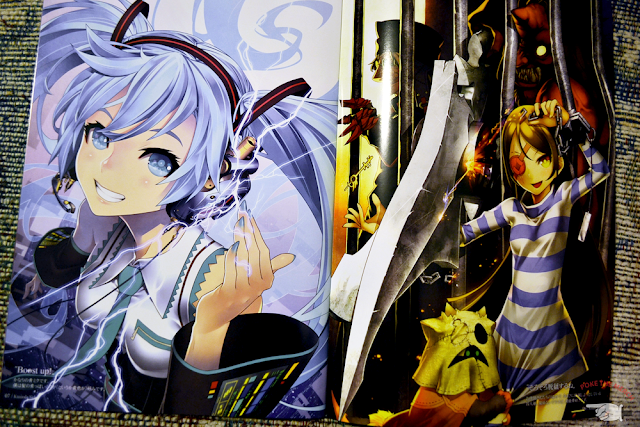
Some beautiful Umineko no Naku Koro ni fanart below.
And Mio.
Once we hit the middle, Aka's side begins.
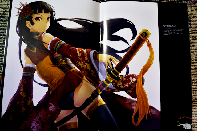
He makes a good impression, opening with a gorgeous girl with a sword. The stylistic differences show up almost immediately. His shading is rounder. His eyes are narrower and more almond-shaped. You can say Aka has the more "realistic" style of the two, albeit neither comes close.
There is also a noticeable difference in picture placement. While Kunieda usually hits us with fully-coloured, one-page spreads, Aka tends to favor more diverse spread ratios.
 |
| Butt sword is sexy. |
More page arrangements? You bet. Both these artists are great with perspective (and strategic flower petal arrangement...although if you look closely...)
That being said, Aka's side also has more blank backgrounds as well.
I love penguins. They're delicious.
As usual with doujinshi, I snatched Collectors off Yahoo Auctions Japan. It's always a little more expensive to order a doujinshi, seeing as they almost always have to be shipped through a proxy service, but with works as nice as these, it's easily worth the price. There's something very clean and neat about Collectors. It's not often I buy a doujinshi or artbook that doesn't have an immediately distinct and unique style, but this one demanded attention.
Pragmatic people say, "Jenn, you can find most of these pictures online. Why pay good tender on something you can get for free?"
And I say, "Because I'm materialistic."
Yes, it's just that simple. I like being able to hold something in my hands. It gives me a sense of ownership. Yes, these pictures can be found online. Yes, they're technically "free". No, buying doujinshi used won't benefit the artist. No, I'm not rich. But I must. Still. Have. Them. It's a compulsion, I tell you. A wonderful, magical compulsion.
Find more works by Kunieda and Aka in their respective blog/gallaries.
Size: A4
Pages: 28
Price: 500 yen
Purchased from: Yahoo Auctions
Stay awesome,
Jenn


No comments:
Post a Comment