
Exclaimation marks aside, I'll be upfront. I'm not impressed with this figure. She's the sort of figure who's beauty correlates negatively with how close you get. From a distance, her vibrant colour scheme and energetic stance pull her from the crowd. Up close, she's an absolute disaster of mediocre shading and substandard paint.
Ai, maybe I've just been spoiled by Alter...
Jenn has a deal going on with Jenn. It goes something like this: DON'T BUY REPEATS (unless they're wearing something substantially different than before), so it's rare that I buy more than one figure of a character. Usually, I only gun for characters that wield destructive weapons, wear lots of red, are crazy, and/or has hair so substantial it warrents its own satellite system. Kureha is none of these, but her kimono-esque attire is pretty. Yes, Jenn suffered a moment of girlish weakness and made a purchase based on looks alone. When I bought Kureha, I was in the wee nascent years of figure collecting, and knew no better than to throw money at every pretty robe that came my way, and boy, was I punished for it!
To the review-mobile!
Kotobukiya's Kureha comes in a surprisingly attractive box. It's simple and uncluttered, with flower cut-out windows.


Kureha's base is an atrocious oval of Tupperware-esque material. This is a horror all Kotobukiya's Shining figures suffer. Not only is it large, it's also permanent. Kureha is screwed into her base, which is a shame since she looks able to stand on her own. I might just take a screwdriver to her one day, you know, to liberate her from the confines of her ugly, brown surfboard. On the bright side (I guess) at least it's not yellow.
She's either going to slap someone with her bow, or karaoke (all she needs is a microphone). As a true embodiment of "handle with care", her bow is incredibly flimsy with an even flimsier string. I wish she came with arrows. Unless she's going to lay some baseball style smack-down, she looks rather silly hefting a bow around with no ammo.


I like her pose. It's whooshy.
Unfortunately, there's disconnect between Kureha's pose and expression. With a pose so fluid, you'd expect an animated face. Personally, I'd like to see her with a little killer gleam, you know, narrowed eyes, slight pout. I'd even settle for resigned, like Alter's Buddy. However, being a Tony Taka, Kureha probably isn't able to experience any emotion more intense than moderate confusion, and Kotobukiya chose to capitalize on her meagre expressive prowess. As she stands, her face is at best, serene, at worst, vapid.
Furthermore, my Kureha's pupils aren't centered. It makes her seem especially unfocused. Hopefully, this error isn't present in all Kurehas.
 |
| Derp. |


 |
| Yikes, look at those seam lines! |
Anyone else find the way she's cupping her right boob a little strange? Not that I'm turned off by a little boob squeeze, no sir. The sculpt on her left boob is very decent.


Kotobukiya tries. I'm sure they try. They've sculpted all the right details into Kureha's costume—the nooks and crannies, the pull lines, the straps—but still something missing...
Oh, right, depth.
Kotobukiya is notorious for their fear of shading. All their figures are freakishly pale. Kureha's skin has almost no tone. Her clothes are only minutely better, with some poo-poo attempt at depth in her sleeves. Her hair is equally washed out, with a single coat of brown and no attempt at variation. Thank goodness it has folds. Otherwise it would be unbearably dingy.
 |
| The tone you see is an illusion. |
Oh no, look at that those inconsistencies. She's definitely a figure to admire from afar.


There is so much bleed on her clothes, and I'm no expert on paint quality, but it also looks like they're using subpar paint in some areas. Her skirt certainly isn't as smooth as her top.


The paint issues are really exemplified in her neck-tie, where both roughness and bleed combine to produce an overall feel of "cheap".
 |
| That's not dust, folks, that's poor quality control. |
Oh, and true to all Shining figures, Kureha is cast off, although the effect is sometimes lost under the massive sleeves. On the bright side, she has a surprisingly nice butt.


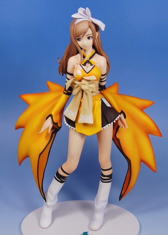
But damn, you can really see the lack of shading in Kotobukiya's Kureha when compared to Max Factory's. Kotobukiya's Kureha's tone is all eww, I mean—zombie—I mean, almost grey.

Kureha's sculpt isn't as bad as her paint job. Her pose is probably the only good thing about this figure. It lends her a great sense of motion, and if anything, makes her seem even larger. That being said, she has some serious seam lines in her hair. Looking closely, you can find faint seam lines on her sleeves and legs as well.
Despite the mediocre job Kotobukiya did on Kureha, she's an easy figure to photograph. There's something about her that translates well on camera, and she does tend to look good from a variety of angles. The movement, I think, really saves this figure from being a real disaster.

The process of photographing her actually warmed me a bit to Kureha. Beforehand, I was adamant to blam it down hard. Now, I'm not so sure. I admit she has display protential, being both bright and dynamic, but then again, there are hundreds of figures out there that look good both from a distance and up close.

So, how does this Kureha stand against other Kurehas?
How do you spell disappoitment? K-O-T-O-B-U-K-I-Y-A.
Kureha is ok. And by ok, I mean, not very good (although I must give kudos to Kotobukiya for making use of her sweeping sleeves). Her lack of shading is a spectacular let down, and even by Kotobukiya standards she's rough.
Truth be told, Kureha had potential, but fell flat on her face (which could also explain her lack of a nose). I feel like I wasted money on her, which is never a good feeling. It's unfortunate that I missed out on Max Factory's fully clothed Kureha. In hindsight, she would have been a far better figure to gun for.
Kotobukiya's Kureha is set for a re-release this December, in case you're interested. I suggest you hold out and wait for her to go on sale. A little bird tells me she`s going to end up in the bargain bin (along with the rest of Kotobukiya`s recent figures).
The Run-Down
Box: 7/10 (Her box is one of the best things about her!...Which is sad)
Base: 4/10 (Tupperware, yuck)
Pose: 8/10 (Energetic and flappy to the max)
Sculpt: 6/10 (Dynamic, numerous seams, disconnect between expression and pose)
Paint: 4/10 (Truly, truly lacking)
Overall: 5.5/10 (What's up Koto? You used to be cool)
Company: Kotobukiya
Price: 5800 yen
Purchased from: AmiAmi
Live long and prosper,
Jenn
No comments:
Post a Comment